Have you ever thought, why do some photos make you sad? And some photos make you feel happy? Or maybe some photos give a strong sense of culture? Even in black and white photos?

Color is a strong tool for shaping perception and emotion in the ever-changing world of photography. Color theory’s impact on photography extends far beyond aesthetics; it influences how viewers interpret a scene, feel its place, and connect with its subject. A thorough understanding of color theory allows photographers to make more thoughtful decisions and evoke moods and emotions.

collected from Pexels

Colour can convey emotion
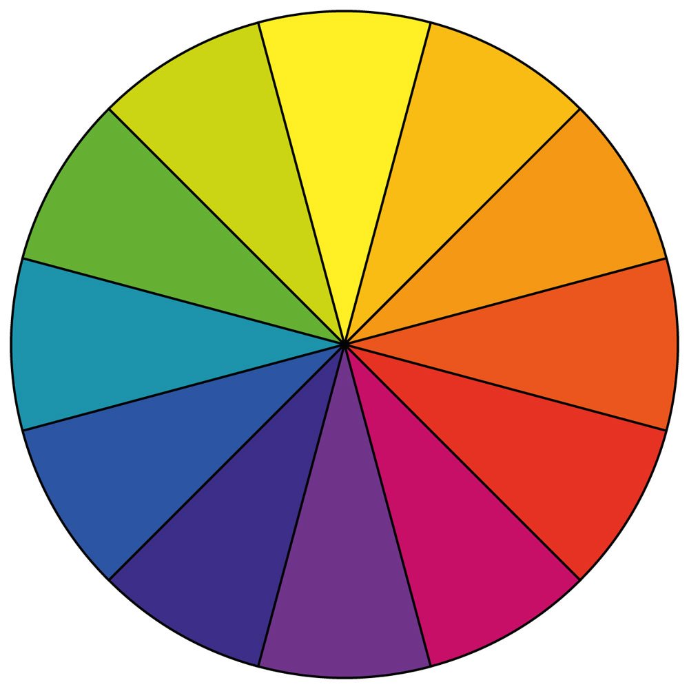
Yes, colour can convey emotion in your photos, but how? After seeing a photo, how will you feel? It depends on the psychological impact of the photo. For example, the colour red conveys love, energy, and passion. On the other hand, the colour yellow conveys joy and optimism, and blue conveys calmness and silence. Grey conveys sadness.

Have you ever thought about why you feel melancholic while it is raining or with a cloudy sky? Why do you feel joyful during spring? Yes, it is because of the colour.
Photographers understand the psychological effects of colour and use them to convey the mood or intended message of the photo.

Color controls attention
Have you ever noticed your eyes always catch strong colours like red, yellow, or blue? This is because the eyes usually go to the strongest color contrast first.

For example, a person wearing red in a mostly urban street scene where most of the colours are grey will immediately stand out because of the colour. Or a yellow umbrella in a rainy blue scene. Colour guides the viewer’s eyes to look there first.

Collected from Pexels

Color harmony makes a photo eye-pleasing
Some colors naturally look good together. This is where color theory helps most. For example, black and white are complementary, creating contrast in photos, or maybe blue and orange. To understand these relationships, we need to understand the colour wheel.

Colour Wheel

Complementary colors

As I just said, the opposite colours on the colour wheel, such as blue and orange, red and green, or yellow and purple. These create strong contrast and make photos pop.

Analogous colors

Colors next to each other, for example, blue, cyan, and green. As seen on the colour wheel, they sit beside each other, which is why they feel very soft, smooth, and harmonious as a palette. They make photos less contrasting and more eye-pleasing.

Monochromatic Colour

Different shades of one color, for example, only blues like light blue, deep blue, etc. This feels clean and minimal.
Photographers often use these on purpose in clothes and backgrounds.

In short, color theory affects your photos by shaping mood, directing attention, improving harmony, and making your story stronger. Learning color theory means you stop just taking pictures and start designing emotion in the frame. Share your thoughts about colour, and tell me what’s your favourite colour. Thank you for reading. Happy clicking.